← Back to Allie's Digital Garden
Converting Unity games into JavaScript: A Practice in "Breaking" Responsive Web Design Best Practices
For the last few weeks I've been working a freelance project for a video game company where I've been asked to convert four financial literacy Unity games for kids into JavaScript for better web performance. I built these games using React, TypeScript, Redux, VideoJS, Tailwind, and a bunch of CSS animations.
Creating these games has been a new, fun change of pace. Even though these games are technically just highly designed web applications, there are quite a few things that I've needed to do/think about that I've never encountered before.
The fact that these were built in Unity initially presented some challenges in recreating gameplay. Being a game engine, Unity has a lot of features, like physics, that JS does not have natively. I didn't want to use a bunch of external packages and bloat out the projects with tools that were overpowered for my purposes, so I was really determined to use just JS and CSS to accomplish all animations and gameplay functionality. This put me in some situations where I had to think about interaction and style in ways that I haven't had to do before.
The games are not available publicly at the moment, so I can't show too much of them yet. But I wanted to write about one early, unexpected challenge that I had when creating these games. The games are not resonsive in the way that every web developer understands that word to mean in 2024. They needed to be built at a fixed aspect ratio of 16:9, and scale up and down depending on screensize with the 16:9 aspect ratio intact.
It sounds really simple, but it honestly took me a bit of time to wrap my head around what it means to build a web app that isn't responsive. I muscle memory used vh and vw quite a few times, only to realize while QA'ing on my larger monitor that some element sizes were not standard across screens.
It also really took some willpower to break through the feeling of hackiness and bad practice that I get when I have to use relative and absolute positioning. When I first started working on the games, I was trying to build them the way that I always build web apps, using things like flexbox and CSS grid and other responsive CSS patterns. I realized quickly that this was futile and I'd never be able to precisely position the art assets to match the designs without explicitely positioning them. I had to give myself permission to abandon my ingrained responsive design habits.
Setting up the inital scaling code took some finagling. I was given some code from a dev at the company I'm making these games for that they had used to scale a different project in a fixed aspect ratio. I took that code and tweaked it to my purposes. I honestly found very little online to help me set this up. It's not surprising that it's uncommon to scale JavaScript web apps in aspect ratio, which meant that I had some pain getting this to work. This is the setup that I ultimately ended up with.
I created a utility function resizeContent:
// resizeContent.ts

export function resizeContent() {
  const layoutWidth = 1920
  const layoutHeight = 1080

  const width = document.documentElement.clientWidth
  const height = document.documentElement.clientHeight
  const scale = Math.min(width / layoutWidth, height / layoutHeight)

  const content = document.querySelector('#content') as HTMLElement

  if (content) {
    content.style.width = `${layoutWidth}px`
    content.style.height = `${layoutHeight}px`
    content.style.transform = `translate(-50%, -50%) scale(${scale})`
  }

  return { width, height, scale }
}
Then, in my main App.tsx file, I set this up in a resize event listener. I also saved the scale value to my global store to be used in other components (more on that later...).
// App.tsx

import { useEffect } from 'react'

import './App.css'

import { resizeContent } from '@/utils/resizeContent'

import { useAppDispatch } from '@/store/storeHooks'
import { setScreenSize } from '@/store/slices/pathSlice'

const App = () => {
  const dispatch = useAppDispatch()

  const styles = {
    width: '1920px',
    height: '1080px',
  }

  useEffect(() => {
    const { scale } = resizeContent()
    dispatch(setScreenSize({ scale }))

    window.addEventListener('resize', resizeContent)

    return () => {
      window.removeEventListener('resize', resizeContent)
    }
  }, [dispatch])

  return (
    <div id="content" style={styles} className="App">
      { // All my markup for the game goes in here. I conditionally rendered screen components for each gameplay screen, but that's another post }
    </div>
  )

}

export default App
And finally, this is the CSS for my base styles use.
/* App.css */

#root {
  position: relative;
  max-height: 1080px;
  height: 100vh;
}

body {
  background-color: black;
  font-family: Raleway;
}

.App {
  background-color: #daa4d7;
  position: relative;
  left: 50%;
  top: 50%;
  font-size: 2rem;
  overflow: hidden;
  background-size: 100%;
  background-repeat: no-repeat;
  display: flex;
  flex-direction: column;
  justify-content: center;
}
This code produced this resizing on the fly. You can see in the element styles that the scale adjusts as I change the screen size.
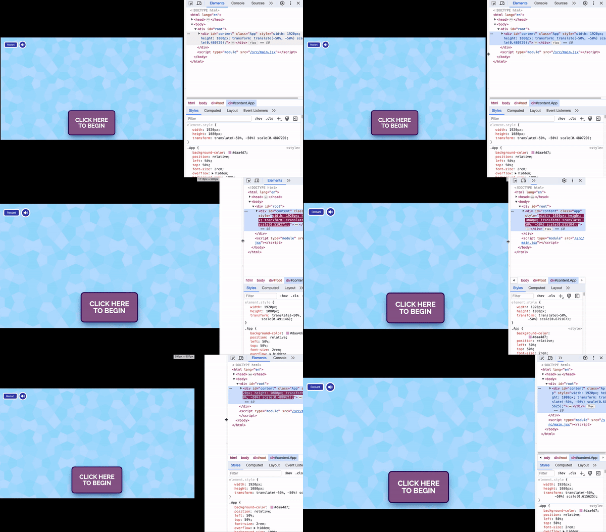
This top level style "trickles down" throughout the rest of the application. All of my art assets and HTML elements resize in accordance to the top level scale.
For the most part, once I implemented this pattern in all the games, I didn't have to think about scaling and sizing aspect ratio anymore. However, there was one game where the scaling came back to bite me.
In one of the games, there is a "click and stick" drag and drop gameplay stage. Basically, you click the item and it sticks to your mouse, it follows your mouse around the screen, and when you click on the correct bucket to drop it off into, it triggers a video that moves you onto the next stage of the game. This is a pretty simple click and mousemove pattern to implement.
I've ommitted my logic around dropping the item into the bucket as it's not relevant to the problem that I'm about to encounter with the code below.
This was my initial attempt at creating this gameplay functionality:
// DragDrop.tsx

import { useState, useCallback, useEffect } from 'react'

const DragDrop = () => {
  const [position, setPosition] = useState<Position>({ x: null, y: null })
  const [itemStuck, setItemStuck] = useState<string>(false)

  const updateMousePosition = useCallback(
    (ev: MouseEvent) => {
        setPosition({
          x: ev.clientX,
          y: ev.clientY,
        })
      }
    []
  )

  const handleClick = (e: MouseEvent, itemName: Items) => {
    updateMousePosition(e)

    setItemStuck(itemName)
  }

  useEffect(() => {
    window.addEventListener('mousemove', updateMousePosition)

    return () => {
      window.removeEventListener('mousemove', updateMousePosition)
    }
  }, [itemStuck, updateMousePosition])

  // Conditionally apply position styles if item is stuck
  return (
    <button
      style={
        itemStuck
          ? {
              position: 'absolute',
              pointerEvents: 'none',
              zIndex: 200,
              left: position?.x || '0',
              top: position?.y || '0',
            }
          : {
              transition: '0.3s ease',
            }
      }
      onClick={handleClick}
      className={classes}
    >
      <img
        src={`/src/assets/img/items/${image}.png`}
      />
    </button>
  )
}

export default DragDrop
Simply put, handleClick is triggered when clicking the item button (sidenote: everything clickable in the games are buttons for keyboard accessibility purposes), which then attaches the mousemove event as an effect of itemStuck being set in handleClick. The mousemove event updates the top and left style attributes on the button according to the mouse's location.
I ran into an infuriating problem with this code. The image would stick to my mouse on click, and would move around the screen as I moved my mouse, however there would be a large gap between the image and my mouse. Depending on the size of my screen, the gap would be bigger or smaller.
This was so infuriating because the functionality was there, but the positioning wasn't.
Eventually, I realized that when my application was at it's fullest scale, there was no gap between the mouse and the image. It was only when the scale was something other than 1 did it start to impact the image's position in relation to my mouse. I needed to adjust the coordinates of the image relative to the center of the scaled window.
I updated my updateMousePosition callback function to take into account the scale of the application, which I grabbed from my global state.
We divide clientX and clientY by 2 to get the horizontal and vertical center of the screen. Then we divide by the scale of our application to scale the mouse coordinates up or down in accordance with the scale. Because of the size of the image, I added some pixels to the x and y positions to make it more centered.
const updateMousePosition = useCallback(
  (ev: MouseEvent) => {
    if (scale) {
      const adjustedX = (ev.clientX - window.innerWidth / 2) / scale
      const adjustedY = (ev.clientY - window.innerHeight / 2) / scale

      setPosition({
        x: adjustedX + 800,
        y: adjustedY + 500,
      })
    }
  },
  [scale]
)
This eliminated the gap between the image and my mouse!
I was so relieved when this worked 😅 Eeven with ChatGPT helping me with the mathy part of this, this was way too much math thinking for one day!
The conclusion that I draw from all of this is that it really takes a mindset shift to go from implementing responsive web design, to implementing fixed, scalable web apps. I don't have a practiced mental model of possible UI bugs that come along with UI's that are fixed in aspect ratio like I have with responsive web design. This was definitely an exercise in reframing how I view a web app's structure.
I've encountered a lot of other interesting and fun challenges in the process of building these games. I'll be writing about more of those things once the games are publicly available!
Comments (0)
No comments yet.